Billboards, Bubbles, and Bright Ideas: Which Iconic Printmaker Energy Are You?


Billboards, Bubbles, and Bright Ideas: Four Printmaker Energies in Everyday Creativity
Printmaking has always had a foot in two worlds: the hands-on craft of ink and paper, and the loud public life of posters, packaging, newspapers, and ads. That mix is why the most iconic figure-inspired printmakers of the last century feel so current. Their work doesn’t just hang quietly in museums; it borrows the language of mass media and sends it back with a twist. If you’ve ever designed a social post like a headline, turned a friend’s photo into a repeating motif, doodled a symbol until it became your signature, or filled a page with patterns until it felt like a whole universe, you’re already playing with the same creative forces this quiz explores.
Andy Warhol’s energy is cool, controlled repetition with a sharp eye for what society can’t stop looking at. Warhol began as a commercial illustrator, and his art never pretended to be above shopping, fame, or branding. He used silkscreen printing, a process that makes it easier to reproduce images, because it matched his subject matter: celebrities, products, and news photos that circulate endlessly. Repetition in his work isn’t just a style choice; it’s a comment on how images lose and gain power when you see them again and again. If your instinct is to take one strong image and run it through variations, crop it like a magazine, or make something feel “official” by keeping it slick and consistent, you’re tapping into that Warhol-like mindset.
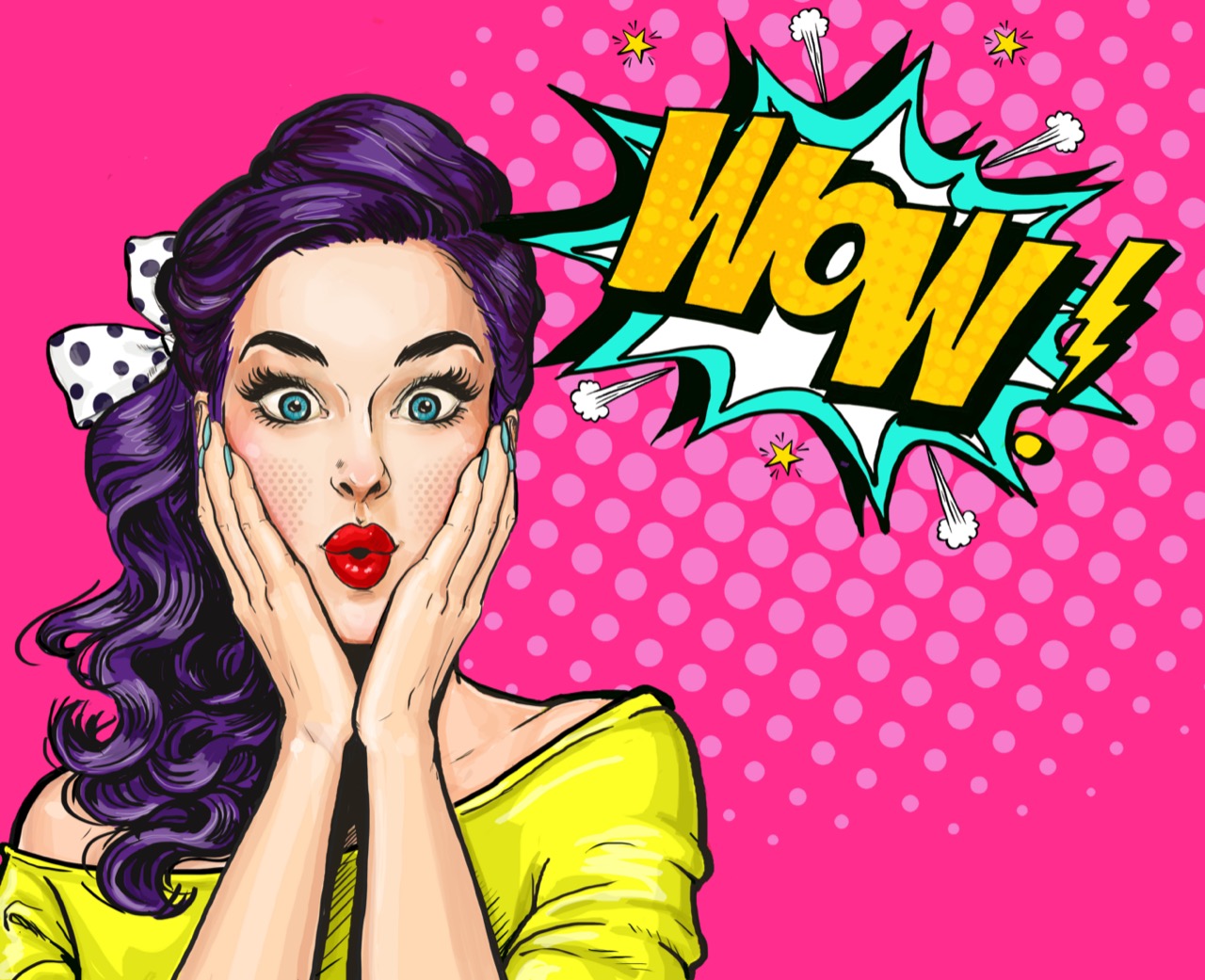
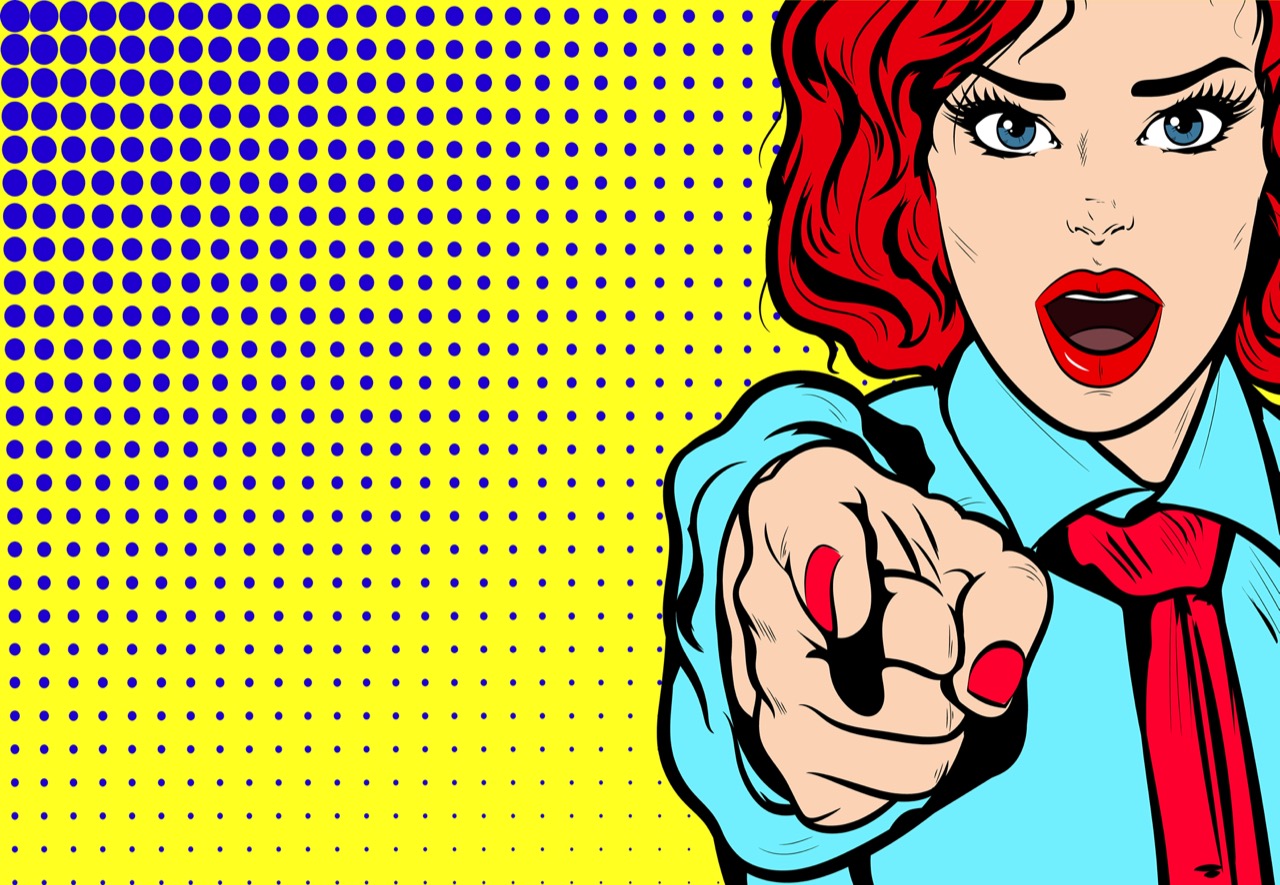
Roy Lichtenstein’s energy is punchy, graphic storytelling that treats everyday drama like a bold panel in a comic. He took inspiration from comic strips and advertising, then rebuilt them at a monumental scale with crisp outlines and carefully placed dots that mimic cheap printing. Those dots, often called Ben-Day dots, were a way printers created shading with limited colors, and Lichtenstein turned that practical trick into a signature look. His work asks a funny question: what happens when you treat a disposable image as high art, and when you treat high art like a billboard? If your creativity leans toward clear lines, strong contrast, and a sense of timing like a joke or a plot twist, you’re in Lichtenstein territory.
Keith Haring’s energy is public-facing rhythm and movement, built from symbols that read fast and travel far. Haring drew in subways, on blank ad panels, using quick lines that could be understood in a glance by commuters. His figures dance, radiate, and repeat like a visual beat, and that speed was part of the message: art belongs in the flow of city life. He also used his visibility to address real issues, including activism around AIDS and social justice. If you like making work that feels like a sign, a chant, or a shared language, and you care about how images function in public spaces, you’re channeling Haring’s kinetic approach.
Yayoi Kusama’s energy is immersive patterning that turns a single mark into an endless environment. Her polka dots and nets can look playful at first, but they’re also intense, methodical, and psychologically charged. Kusama has spoken about using repetition to manage overwhelming sensations, and her work often blurs the line between decoration and obsession. In print terms, pattern is powerful because it can scale: a tiny motif can become wallpaper, fabric, a zine spread, or a room-sized installation. If you find yourself calming down by filling space with repeated shapes, building palettes that feel like a dream you can step into, or making a world that multiplies the longer you look, you’re close to Kusama’s wavelength.
The fun of matching yourself to one of these energies isn’t about copying famous art; it’s about noticing your default creative habits. Do you collect images like a curator of pop culture, or do you build punchlines with line and color? Do you want your work to move through crowds, or do you want it to surround someone completely? Try using your result as a practical prompt: limit your palette to two loud colors, repeat one photo nine times, draw a simple symbol until it feels like a logo, or design a pattern that could wrap around an entire room. Printmaking’s central idea is multiplication, and your best ideas often get stronger when you let them echo, stack, and spread.