Hidden Stories Inside Pop Art Classics Reloaded


Quiz Complete!
Hidden Stories Inside Pop Art Classics
Pop Art can look like a celebration of the obvious: celebrities, soup cans, comic strips, brand logos, bright colors. But many of its most familiar images are built on surprisingly specific behind-the-scenes decisions, and those choices often mattered as much as the final picture. The movement thrived on borrowing, repetition, and the visual language of mass media, which meant the source material was rarely neutral. A single photograph clipped from a newspaper, a promotional still from a film studio, or a comic panel inked by an uncredited assistant could become the foundation for a museum icon.
One of the most common misunderstandings is that Pop artists simply copied what they liked. In reality, many worked like editors and producers. They selected images that already carried cultural charge, then changed the context so the viewer would notice what was usually ignored. A tabloid-style headline, a product label, or a publicity portrait was chosen not just for recognizability but for its built-in promise: glamour, desire, urgency, patriotism, or fear. When an artist repeated the same face or object again and again, it could read as celebration, but it could also feel like a critique of how media turns people into consumable units.
The printing methods were not just technical details; they shaped the meaning. Screenprinting, for example, allowed an artist to mimic commercial production while still leaving room for human variation. Misregistration, uneven ink, and small imperfections could make each print slightly different, a reminder that even mass culture is made by hands and machines that fail. The choice of garish, non-naturalistic color often came from the practical logic of printing as much as from pure style. High-contrast palettes and flat areas of color reproduced well, grabbed attention from a distance, and echoed the punchy look of advertising. Sometimes a color decision was an experiment that stuck: a test print that looked unexpectedly electric could become the final version because it felt closer to the sensory overload of modern life.
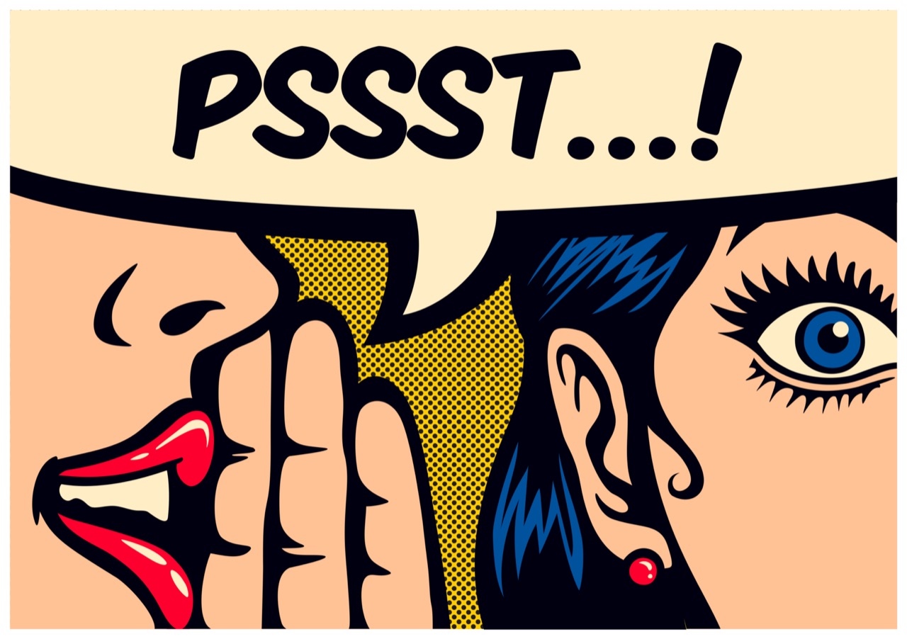
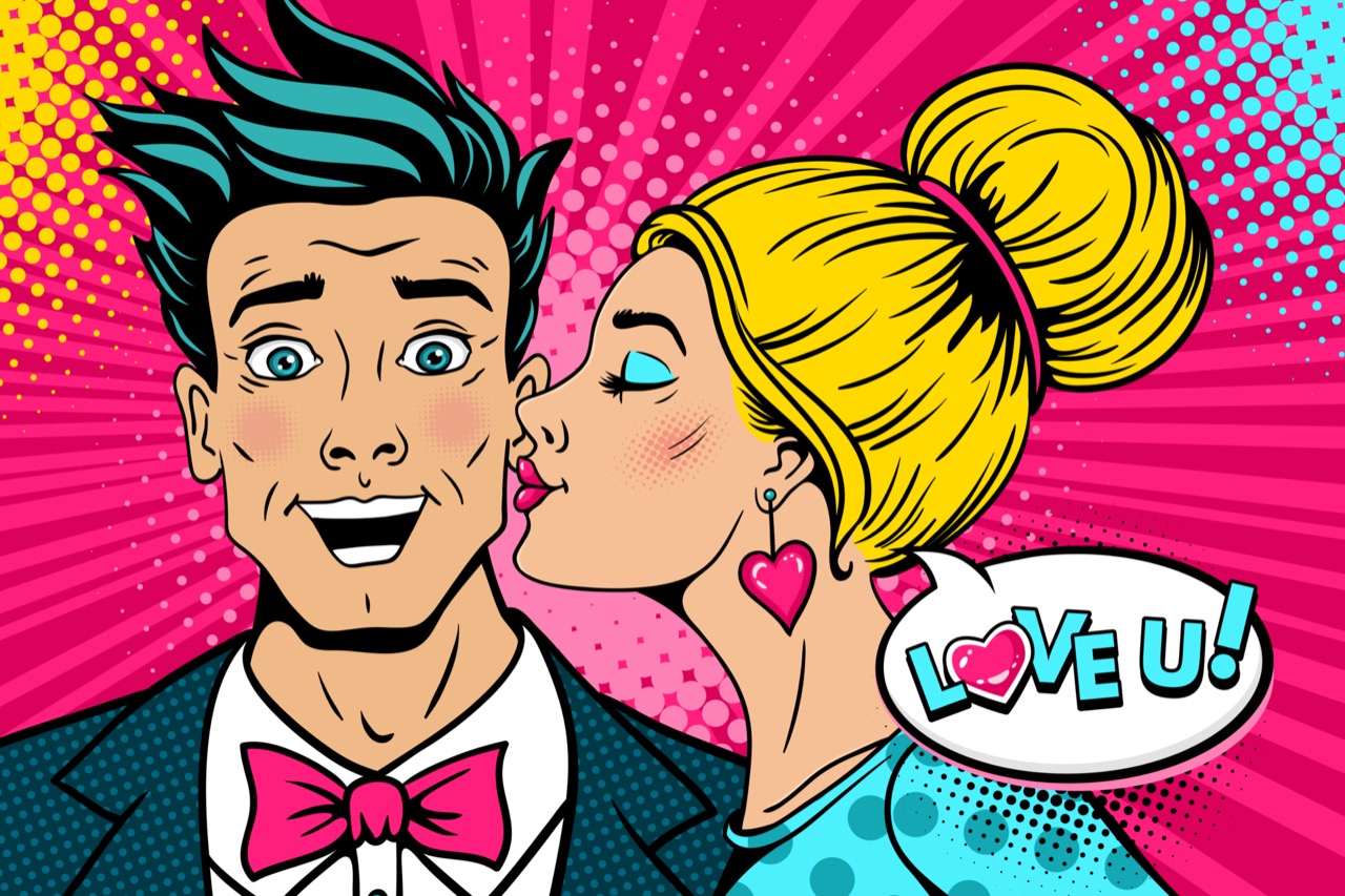
The famous relationship between Pop Art and comics also hides a complicated story about authorship. Comic imagery was typically produced by teams, with pencillers, inkers, colorists, and letterers contributing to a single panel. When a Pop artist enlarged a scene of melodrama or romance, the result could spotlight how emotionally direct comics were, but it also raised questions about credit and ownership. Those questions became even sharper when the borrowed image was traceable to a particular publication and a particular working artist. Pop Art helped push the art world to confront a basic issue of modern visual culture: when images circulate everywhere, who owns them, and what counts as transformation?
Celebrity portraits carry their own hidden histories. Many were based on specific publicity photos chosen for their clarity and their already-polished mythmaking. A studio portrait is designed to be endlessly reproducible, which makes it a perfect starting point for art about replication. But once that face is repeated in different colors, cropped, or pushed toward abstraction, the portrait can shift from adoration to unease. The same smile can look triumphant in one colorway and ghostly in another. In some cases, the timing of the image mattered too. A portrait made near a major public event could feel like a snapshot of a cultural mood, not just a depiction of a person.
Even the most ordinary objects in Pop Art were rarely chosen at random. A soup can, a soft drink bottle, or a box from a supermarket aisle could be selected because it was widely distributed and visually consistent, almost like a logo for everyday life. Packaging design was a form of persuasion, built to be recognized instantly, and Pop artists understood that a label could function like a portrait of a society’s habits. By isolating the object and presenting it with the seriousness of fine art, they forced viewers to consider how much of their identity was shaped by what they buy and what they see.
What makes these backstories so compelling is that they reveal Pop Art as both playful and strategic. The movement’s most iconic images are not just bright surfaces; they are records of choices about sourcing, printing, repetition, and timing. Knowing where an image first appeared, how it was reproduced, and why it was selected turns a familiar picture into a small detective story. The next time a Pop Art classic looks effortless, it is worth remembering how much of its power comes from the strange, precise path that brought a piece of mass media into the realm of art.