Rebel Prints and Pop Shocks Trivia


Quiz Complete!
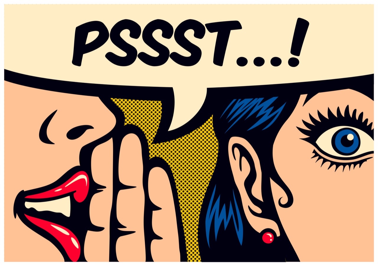
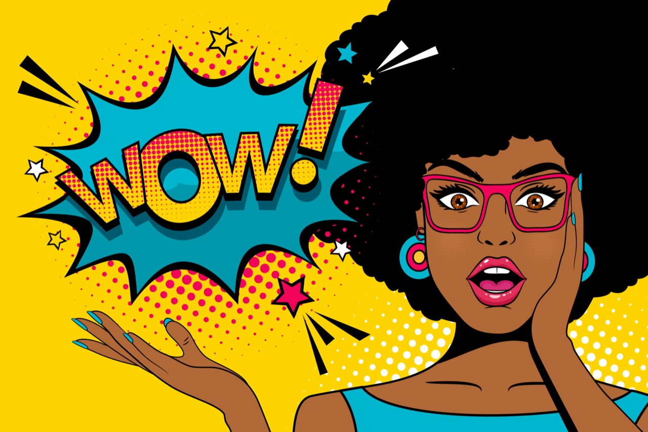
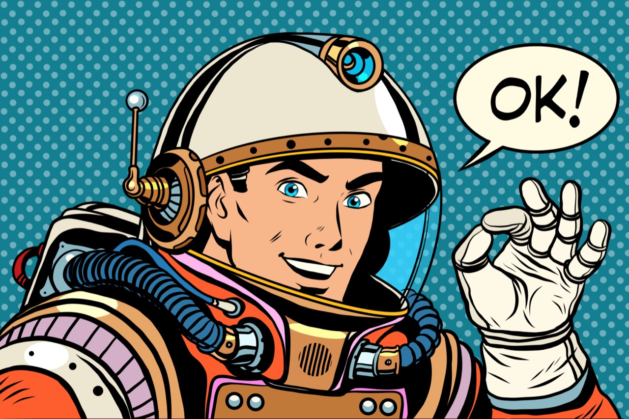
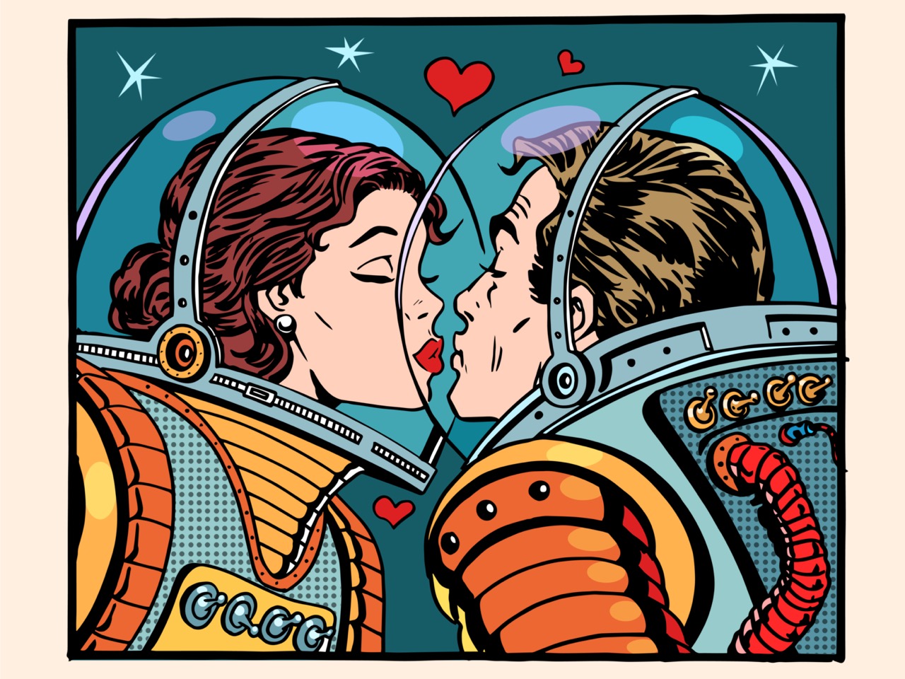
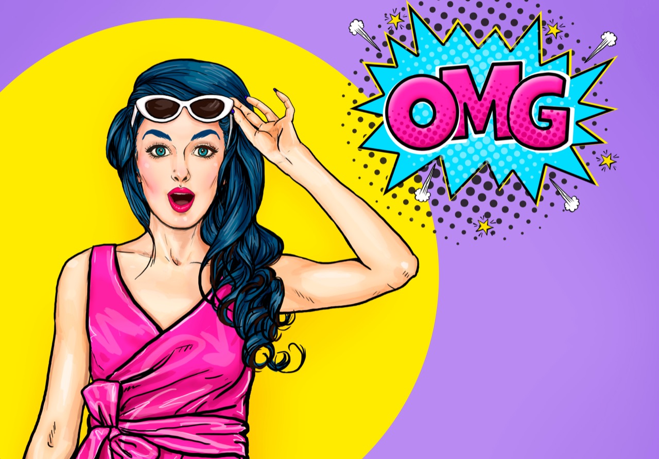
Rebel Prints and Pop Shocks: How Pop Art Turned Everyday Life into Iconic Images
Pop Art arrived with the glare of a billboard and the punch of a comic-strip sound effect. In the late 1950s and early 1960s, many artists were tired of the idea that serious art had to be mysterious, emotional, or hard to decode. Instead, they looked at what most people saw every day: advertisements, supermarket packaging, movie stars, television, and mass-produced objects. By borrowing the look and language of popular culture, Pop artists challenged the boundary between high art and ordinary life, and they did it with bright color, bold outlines, and images that felt instantly familiar.
One key to Pop Art’s impact was technique. Screenprinting, a commercial process used for posters and product graphics, became a powerful tool in the studio. It allowed artists to repeat an image again and again with slight variations, creating the sense of mass production inside a gallery. Repetition itself became a statement: if you see the same face or product over and over, does it become more meaningful, or does it turn into a kind of visual noise? Andy Warhol made this question impossible to ignore. His portraits of Marilyn Monroe and other celebrities, and his images of Campbell’s soup cans, looked simple at first glance but carried sharp ideas about fame, desire, and the way consumer culture shapes memory.
Warhol’s studio, famously called the Factory, pushed the idea of art as production. Assistants helped execute works, and the process could resemble an assembly line. That approach shocked people who believed art had to be handcrafted by a solitary genius. But it also reflected the modern world, where images are manufactured, distributed, and consumed at high speed. Warhol’s work often kept an emotional distance, and that coolness was part of the provocation. He treated tragedy and glamour with the same graphic force, reminding viewers that the media can flatten everything into a headline or a product.
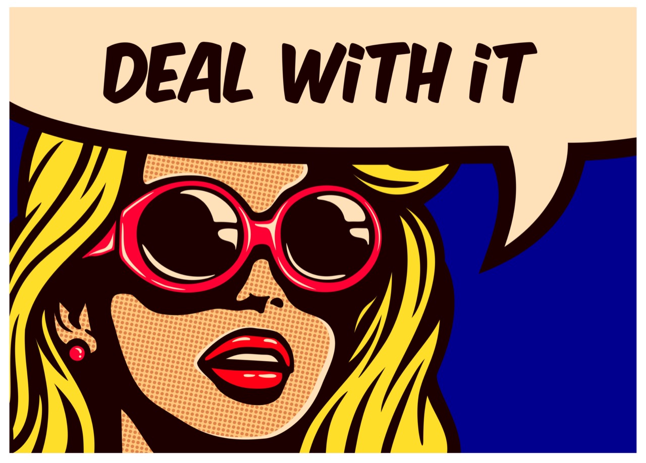
Comic books and printing dots also helped define Pop’s look. Roy Lichtenstein transformed panels of romance and war comics into large paintings, carefully mimicking the Ben-Day dots used in cheap printing. Blown up to museum scale, those dots became both a visual thrill and a critique of how mass media packages emotion. His paintings often raised the question of originality: if the source image already existed, what changes when it is remade as fine art? The answer was not just size, but context, technique, and the artist’s choices about color, cropping, and emphasis.
Pop Art was never only American. In Britain, artists such as Richard Hamilton helped set the stage by examining consumer goods and modern interiors with a mix of curiosity and satire. Across the movement, Pop absorbed the energy of advertising and design, borrowing crisp lettering, flat color, and attention-grabbing compositions. It also fed on the era’s music, television, and celebrity culture, where personalities became brands and images traveled faster than ever before.
The movement’s headline-making moments often came from its audacity. Turning a common object into art could feel like a prank, but it was also a serious question: who decides what deserves attention? Pop Art made galleries look like storefronts and made viewers rethink their own habits of looking. It asked whether the images that surround us are harmless decoration or a powerful force shaping what we want, what we admire, and what we believe. Even today, in a world saturated with logos, memes, and endlessly repeated faces, Pop’s bright shocks still feel like a mirror held up to modern life.