Halftone Heat Check: Which Neon-Brain Art Savant Are You?


Halftone Heat Check: How Pop, Print, and Mass Media Turn Knowledge into Neon-Brain Art

Bright color and sharp irony didn’t arrive in art by accident. They grew out of a world that was suddenly saturated with advertising, television, glossy magazines, and supermarket packaging. When artists began borrowing the look of comic panels, celebrity headshots, and brand logos, they weren’t just changing style; they were changing how images behave. A painting could act like a headline. A print could mimic a billboard. A portrait could feel less like a person and more like a product. Understanding this era means learning to read art the way you read media: noticing repetition, shortcuts, and the tricks that make something stick in your memory.
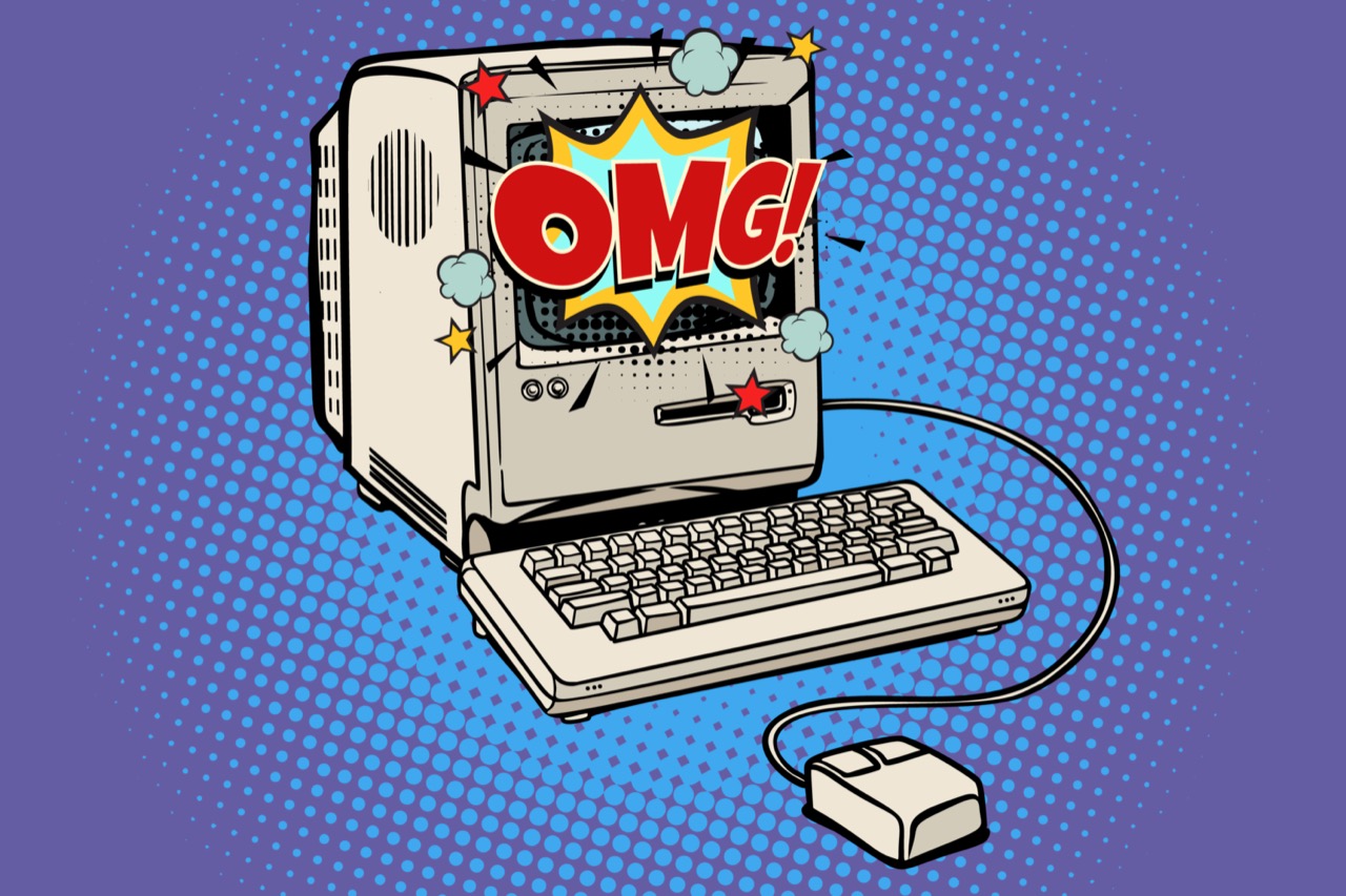
A lot of the “electric” look comes from very practical methods. Halftone dots, for example, are a printing technique that turns continuous tones into patterns of dots. In newspapers and cheap magazines, halftone was a necessity; in art, it became a statement. When an artist enlarges those dots, you become aware of the machinery behind the image, and the work starts talking about reproduction itself. Screenprinting adds another layer of meaning. It’s a process designed for making multiples, which immediately raises questions about originality. Is the first print more authentic than the hundredth? What does “handmade” mean when the image is pulled through a mesh screen with a squeegee? Even the imperfections matter. Misregistration, when color layers don’t line up perfectly, can turn a face into a vibrating mask. What a commercial printer would reject, an artist might celebrate as proof of process.
Edition numbers are another hidden language. Prints are often made in limited runs, and the size of an edition affects scarcity, price, and prestige. You might see markings like 12/100, meaning the twelfth print in an edition of one hundred. Artist’s proofs, sometimes labeled AP, are prints set aside outside the numbered edition and can become especially desirable. Then there are variants: different colorways, different papers, or slight changes in the screen. Collectors and critics can obsess over these details because they reveal intent and context. A small shift in ink can change a work from glossy and commercial to gritty and confrontational.
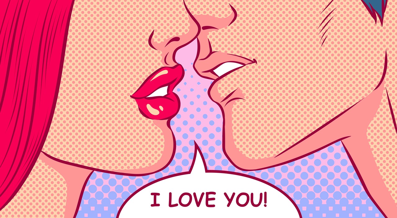
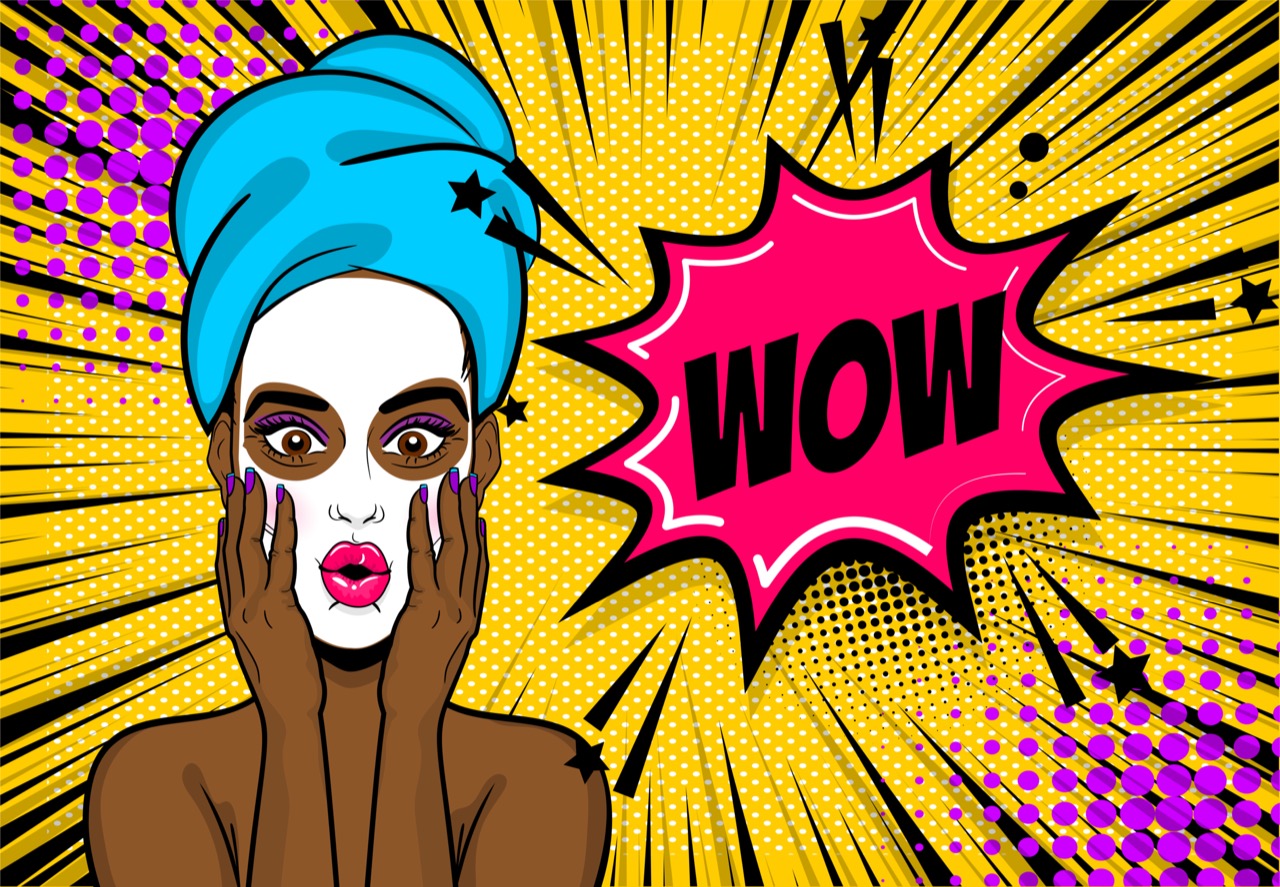
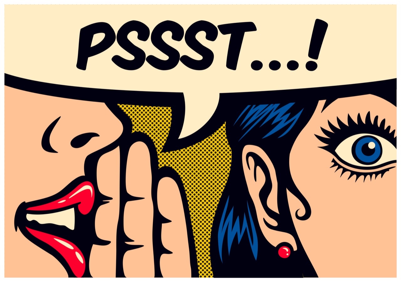
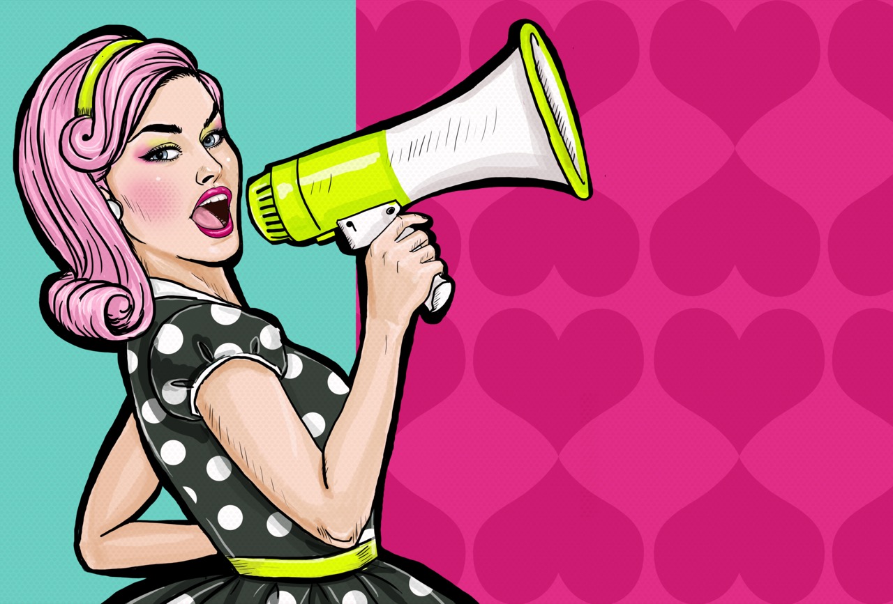
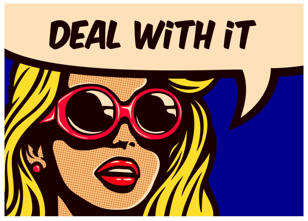
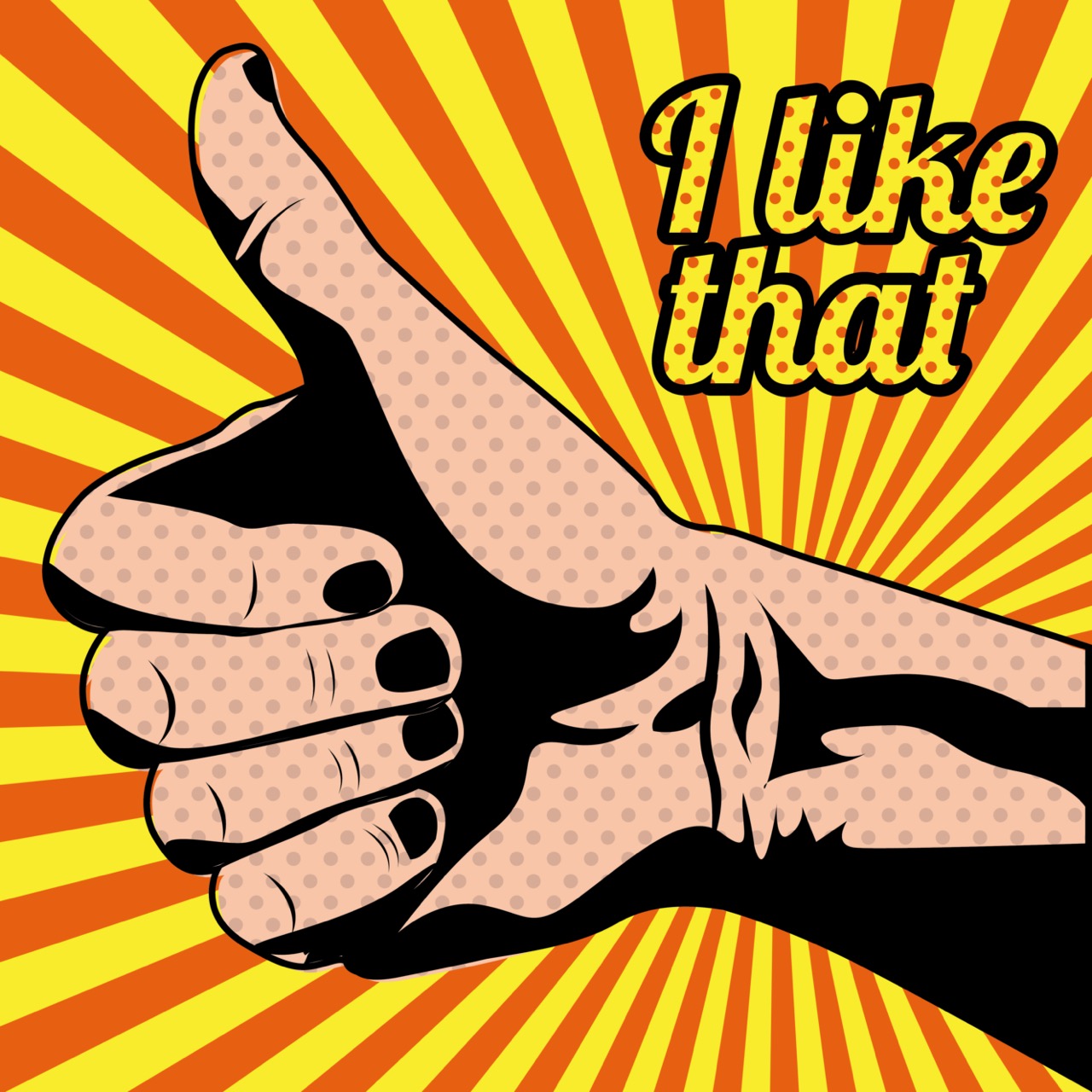
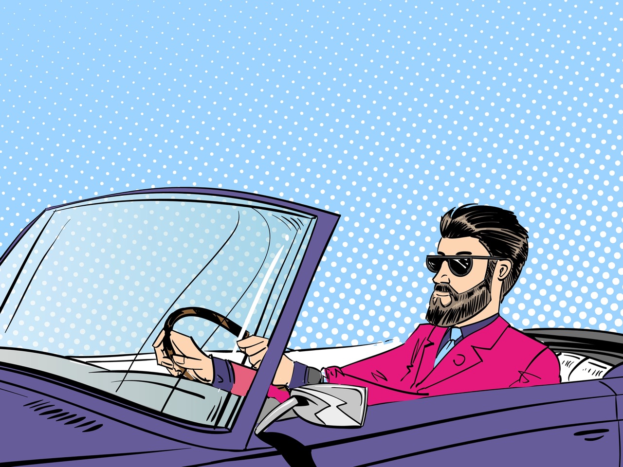
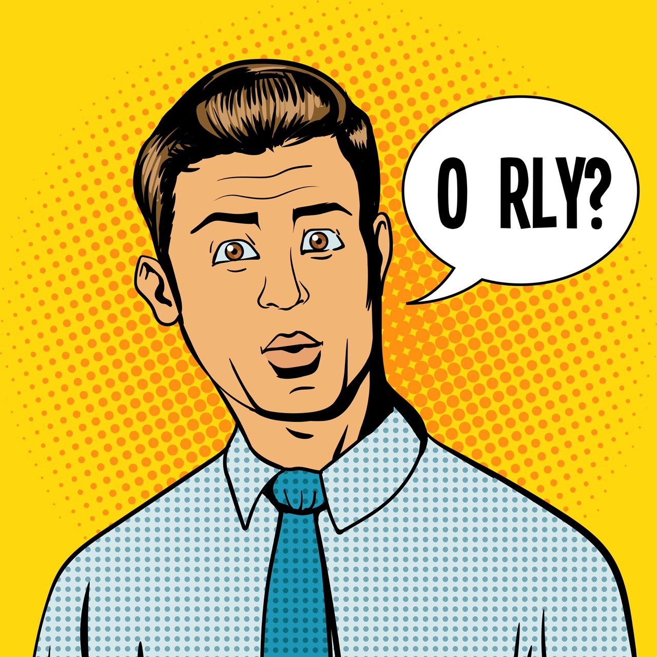
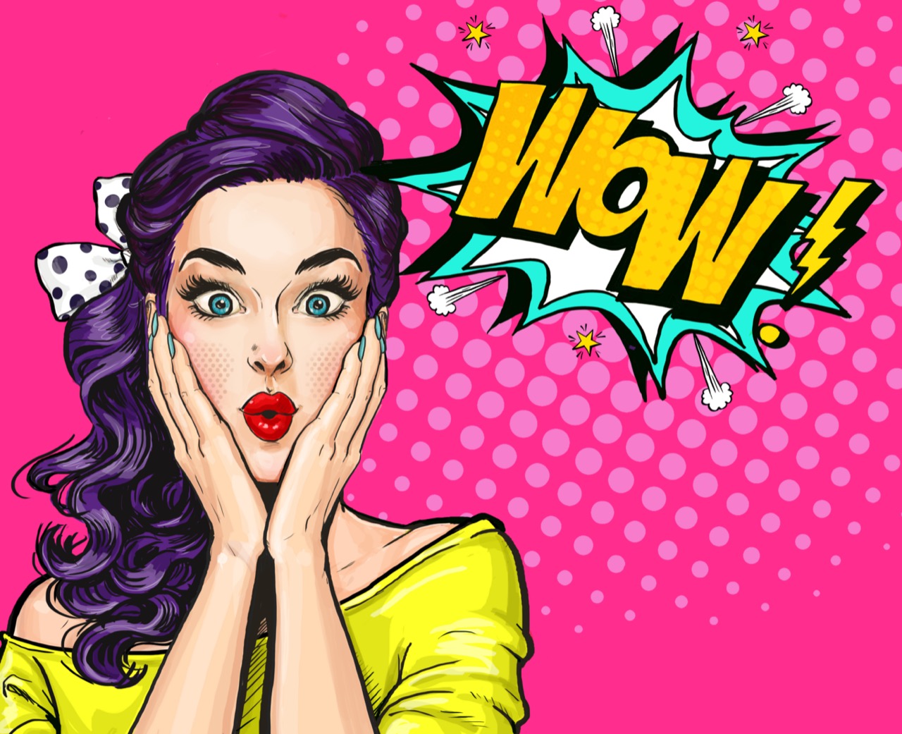
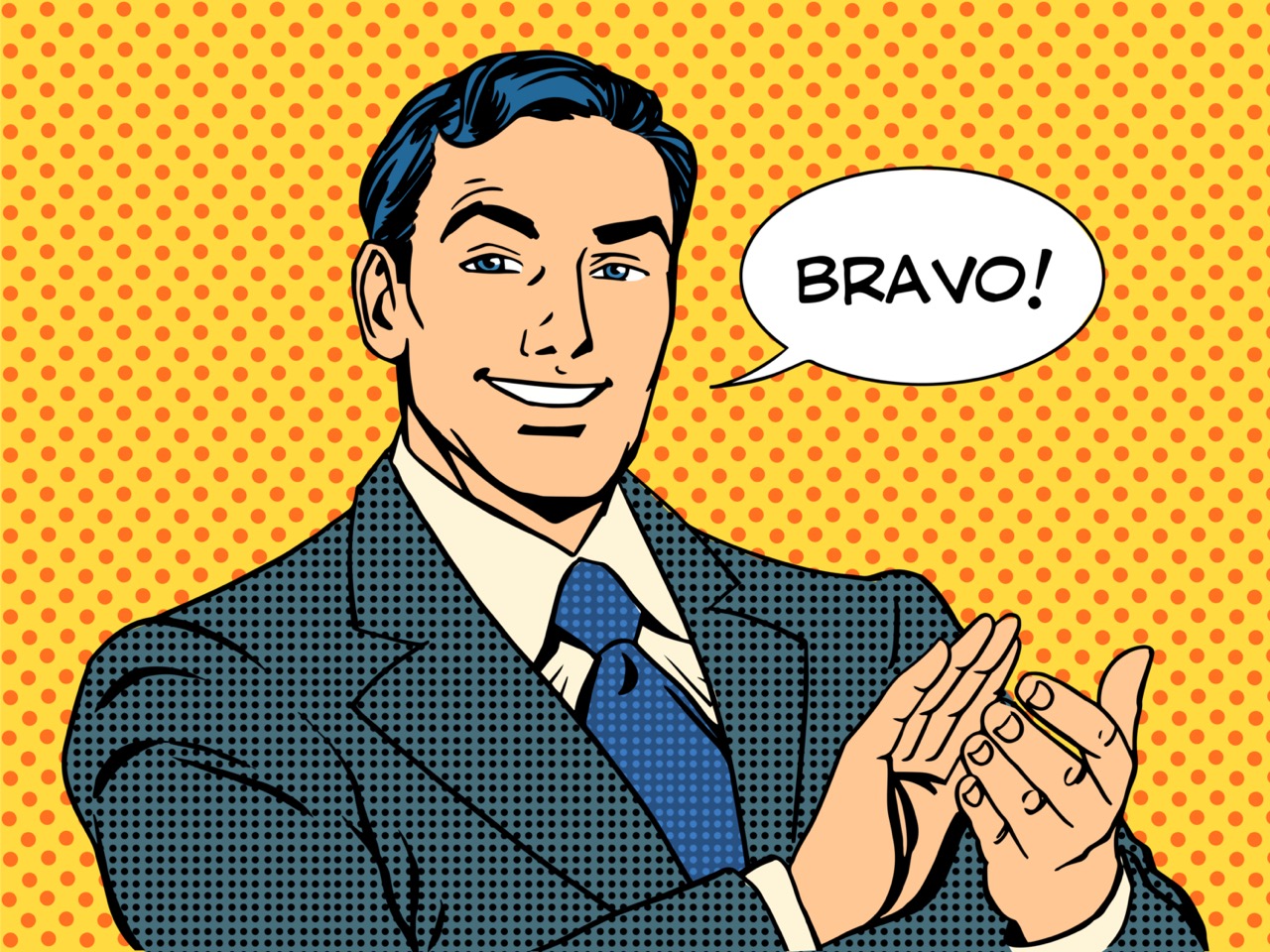
But the technical side is only half the story. Pop-inflected art thrives on cultural impact: the way an image travels, mutates, and becomes a shared reference. Celebrity portraits are a perfect example. They can be admiration, critique, or both at once. The face becomes a surface for projection, and fame becomes a kind of currency that can be printed, traded, and consumed. The same goes for everyday objects. When a soup can or a detergent box is elevated into art, the question isn’t just “Is this beautiful?” It’s “Why do we trust this design?” and “How much of our identity is built from purchased symbols?”
Galleries and critics played a major role in turning these strategies into an art-world force. Showing work that looked like advertising inside a white-walled gallery created productive friction. Some viewers felt tricked, others felt liberated, and many felt both. The best works use that tension. They deliver instant visual punch, then reward closer looking with clues about technique, repetition, and the economics of attention.
If your instinct is to chase provenance, you’re drawn to the paper trail: who printed it, where it was shown, how it moved from studio to collector. If you live for impact, you track how an image lands in public life and why it becomes iconic. If you think like a technician, you notice ink density, screens, and the tiny decisions that make color snap. If you lean provocateur, you look for the joke, the jab, and the way a bright surface can smuggle in a sharp critique. However you approach it, this neon-brain universe rewards the same skill: the ability to see both the picture and the system that produced it.